Coyote
What we did
Brand narrative
Brand character
Brand behaviors
Tone of voice
Hero statements
Brandmark, symbol, wordmark
Color, typography
Photography style
Photoshoots & original photography
Brand guidelines
Data visualization
Website
Merchandise
Print ads
Business cards
Overview
Coyote is a leading third-party logistics provider. Their platform matches the needs of retailers and manufacturers with freight and transportation solutions. According to Inc. Magazine, “Coyote finished 2011 with $560 million in revenue. That figure places it among the top transportation management companies in North America…” Coyote sought to upgrade their brand to equal the tenor and growth of the company.
Solution
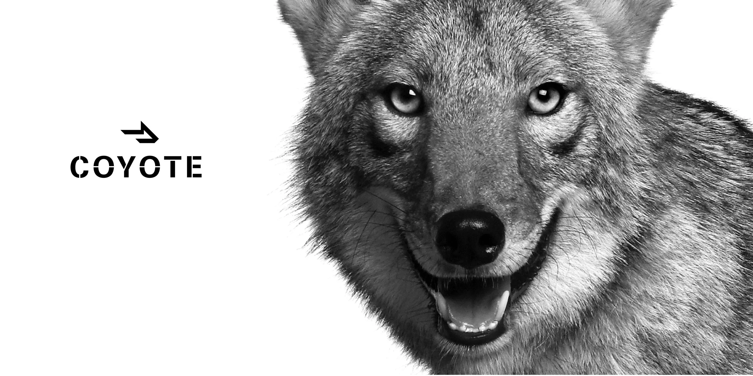
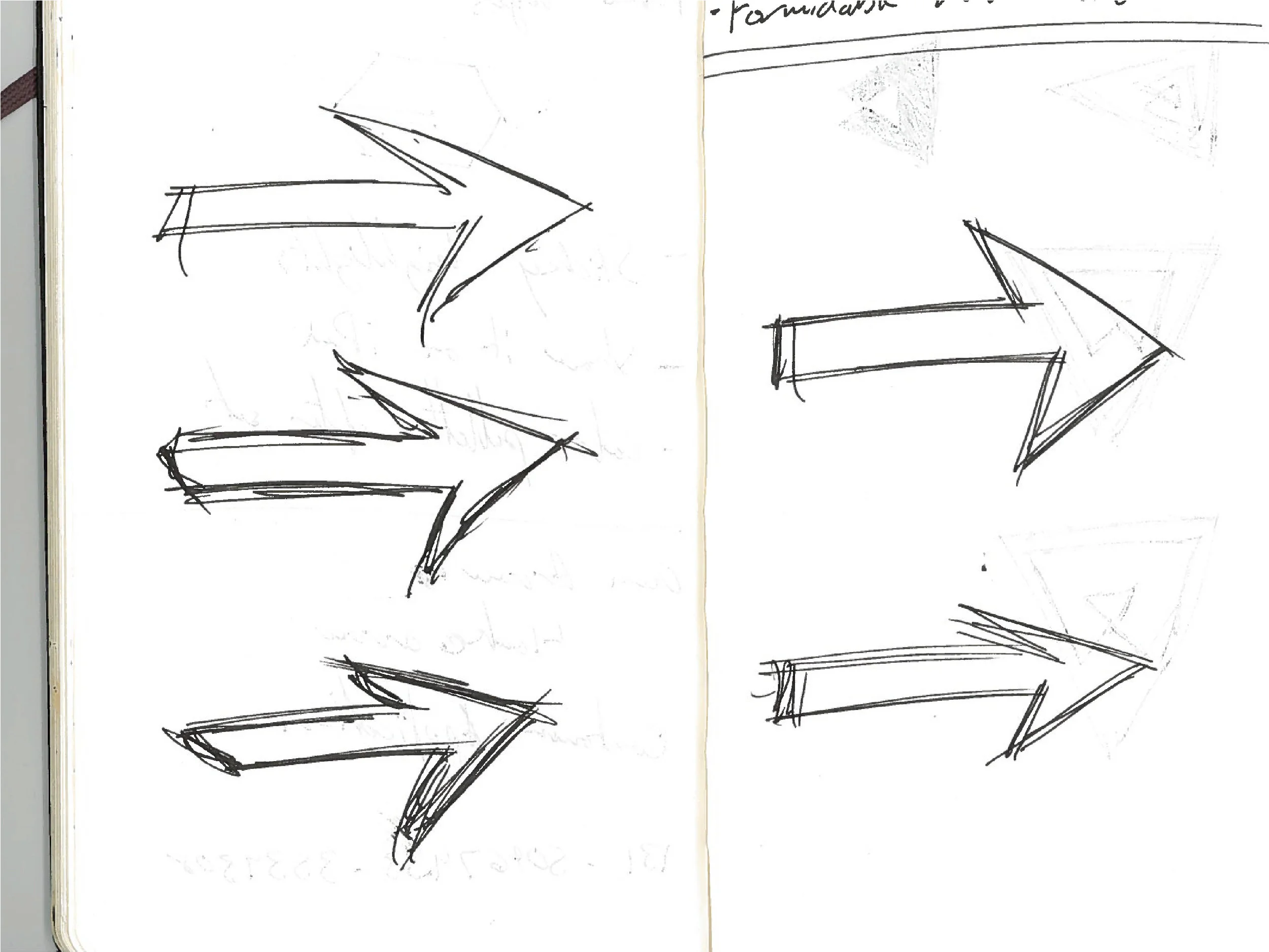
We created a system that encapsulates the tenacity of spirit, no excuses attitude and decisiveness of the brand. The symbol, an abstraction of a coyote’s silhouette, builds upon the name and embodies a strong, forward direction. Combined with motion-inspired graphic elements, they reinforce the brand narrative: Powerful Momentum. Typography is bold and purposefully stark. A stenciled wordmark emphasizes the direct boldness of the symbol, while large impact statements personify the enthusiasm, integrity and productivity that is central to Coyote’s character.
* In 2015, four years after the rebrand, UPS bought Coyote for 1.8 billion. (source: The Wall Street Journal, July 31, 2015)
* This project was reviewed on Under Consideration Brand New on Jan. 23, 2012.
* I designed this project as part of the Moving Brands team.


