Acutect
What we did
Brand narrative
Brand character
Company name
Product naming
Tagline
Brandmark, symbol, wordmark
Color, typography
Graphic elements
Brand guidelines
Sales & promo materials
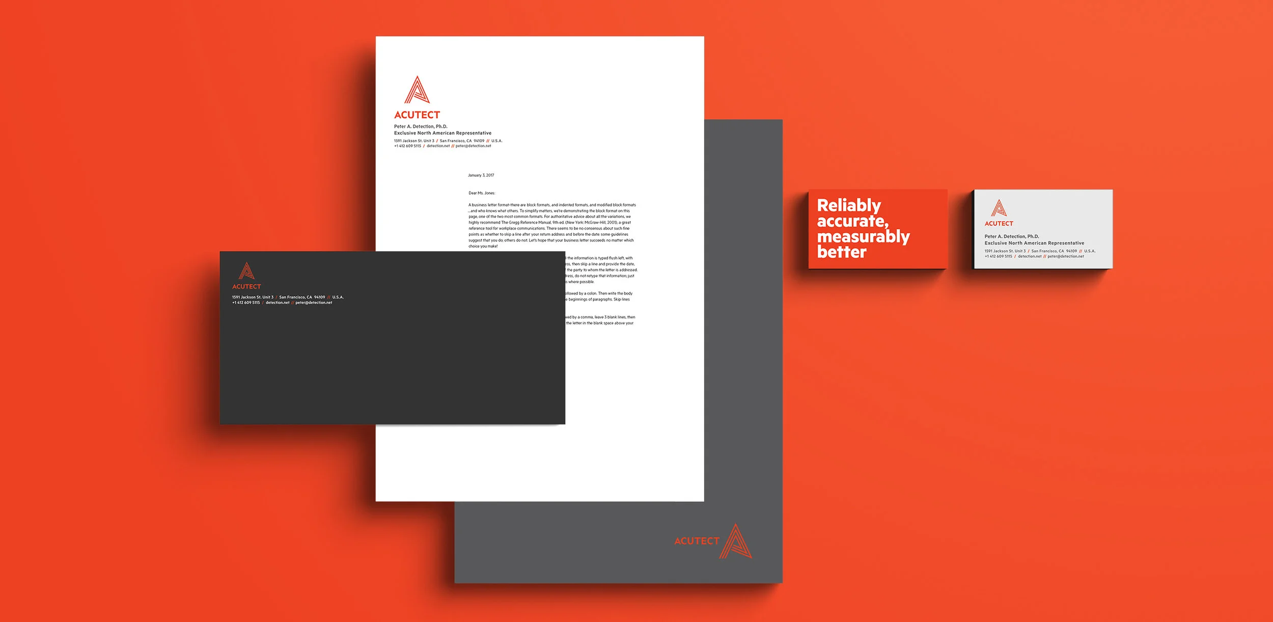
Business card & stationary
Animation
Overview
Acutect is a Chinese company that develops and manufactures high end optoelectronic devices and gas monitoring products. They were expanding into the US market with high expectations of success with their portable, gas detecting devices and technology. This expansion required a rename and rebrand that would appeal to the American market and overcome the belief that Chinese manufacturing was synonymous with low-quality goods.
Solution
Ethera created an internal brand strategy and reworked the company name and tagline, combining accurate and detection, to create the name Acutect, which put the product and purpose front and center. The new tagline, “Reliably accurate, measurably better” emphasized the products’ benefits of reliability and safety for customers. The boldness and weight of the design reflect the sturdiness and dependableness of the product. In designing the look and feel, Ethera incorporated subtle laser elements into the “A” symbol and chose bright orange and yellow colors to reflect the industrial feel of the devices and to increase visibility in the field.
* This project was done through my design studio, Ethera.


